Colour Guides
How to Find Your Perfect Colour Palette
A simple, no-rules way to find the shades that make getting dressed feel easier.
In This Guide
- The Coat That Made Me Look Like I Had Slept
- Start With What Makes You Look Rested
- Build a Palette You Will Actually Wear
- Keep the Colours You Love
- The Power of Tonal Dressing
The Coat That Made Me Look Like I Had Slept
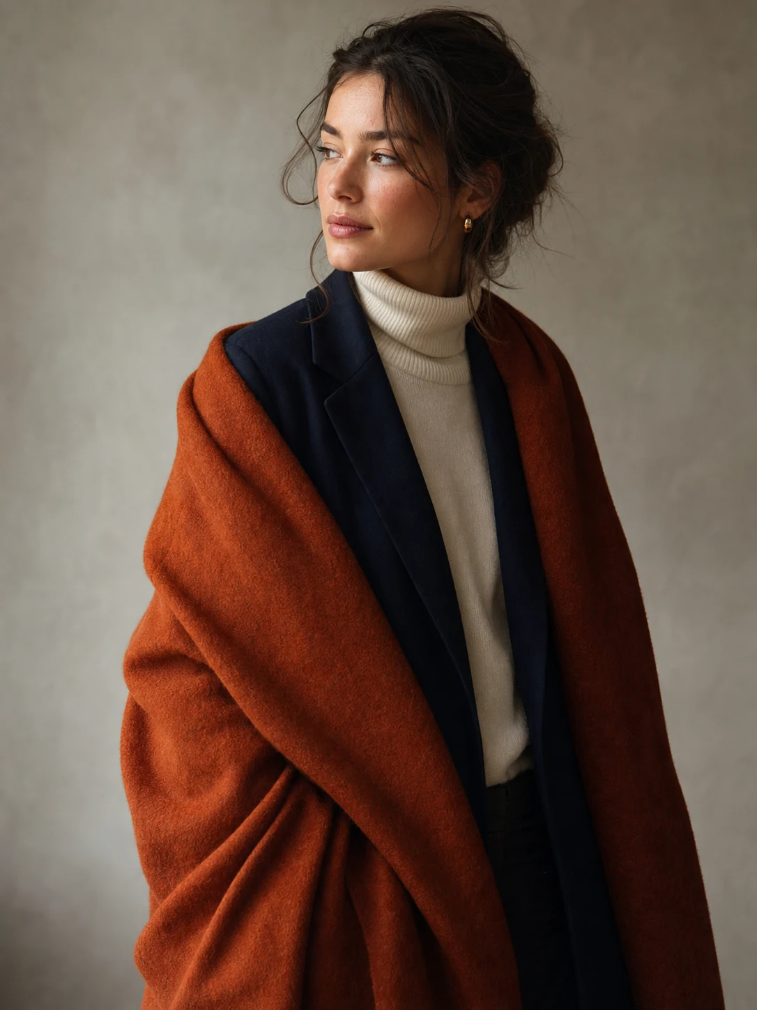
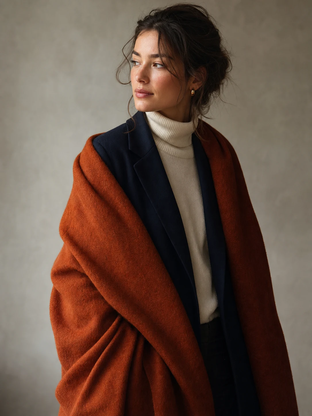
A friend of mine owns a beautiful rust-coloured coat. Every autumn, she puts it on, looks in the mirror, and says exactly the same thing.
"Why do I suddenly look like I have a complicated opinion about olive oil?"
The coat is lovely. The problem is not the coat. It is just much warmer and brighter than her face wants to be at eight in the morning. Beside it, her skin looks tired; her under-eye circles get a speaking role; even her coffee seems concerned.
One day, she replaced it with a deep navy coat and a soft grey scarf. Same trousers. Same shoes. Same person who had absolutely not become more organised overnight. But suddenly she looked rested, polished, and slightly more likely to answer an email before lunch.
"So navy is my personality now?" she asked.
No. Navy is not a personality. It is simply one of the colours that lets her face do the talking. That is the point of a personal colour palette: not to give you a new identity, but to make the clothes you already love work a little harder for you.
Start With What Makes You Look Rested
A personal colour palette is not a set of rules waiting to confiscate your favourite sweater. It is a useful shortcut: the shades that make your skin look clearer, your eyes more awake, and your getting-dressed routine a little less dramatic. The most useful place to begin is not a trend report. It is your own face in soft daylight.
Try three gentle checks. First, hold ivory and bright white near your face. If ivory brings warmth and softness, you may lean warm; if clear white makes you look fresher, you may lean cool. Next, compare gold and silver jewellery. Finally, notice the colours you repeatedly wear on good days. None of these tests is a verdict. When they point in the same direction, though, you have a useful clue.
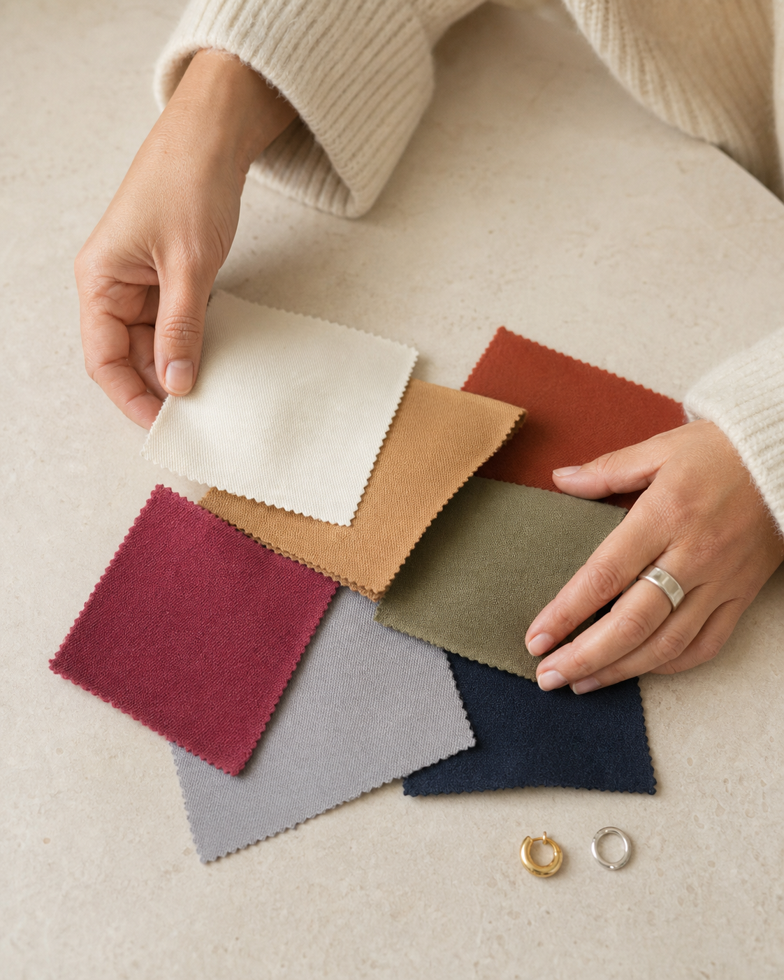
Do the comparison on a calm day, without trying to decide your entire future in ten seconds. Ask a simple question: which colour makes me look as though I drink water and return phone calls? That is usually more useful than staring at the veins on your wrist until they feel personally uncooperative.
Build a Palette You Will Actually Wear
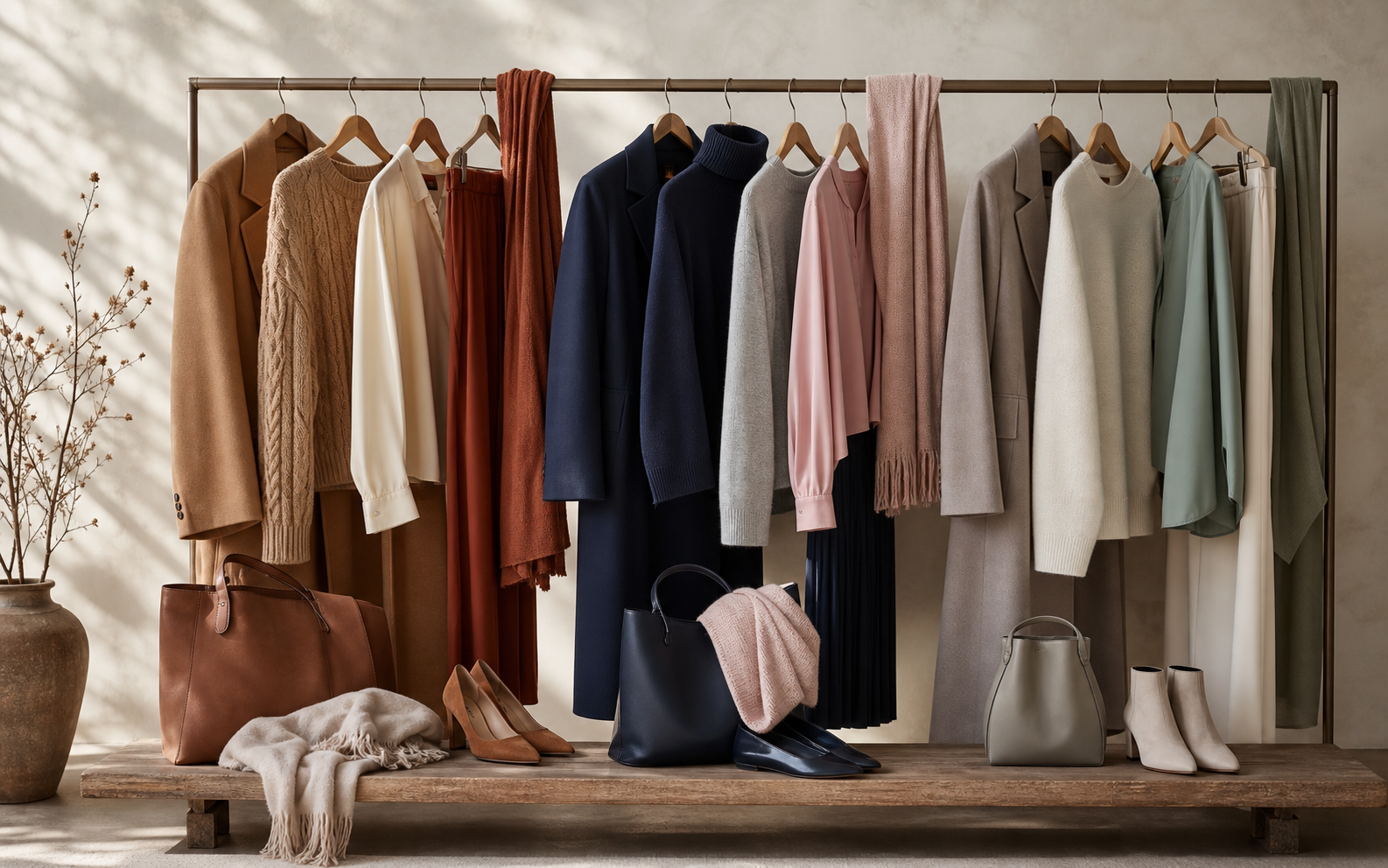
Once you have a direction, keep it practical. Warm colouring often feels at home with cream, camel, chocolate, olive, terracotta, and softened coral. Cool colouring can begin with crisp white, charcoal, navy, dove grey, soft rose, berry, and blue-red. Neutral colouring has the widest bridge: taupe, soft navy, mushroom, ivory, muted green, and dusty pink tend to mix beautifully.
Start with two or three dependable neutrals, then choose one or two accents you genuinely enjoy. You do not need to buy a new wardrobe to make this work. Open your closet and look for the colours already appearing again and again. Those repeats are often your real palette, not because an algorithm chose them, but because you have already been choosing them.
A new piece earns its place when it works with at least two colours you own. Otherwise it may become one of those garments that was magnetic in the fitting room and oddly lonely at home. Beautiful, charming, completely unable to join the group chat.
Keep the Colours You Love
If a colour makes you happy but feels a little harsh near your face, it does not need to leave your life. Wear it as trousers, a skirt, shoes, a bag, or an outer layer over a more flattering top. A bright orange knit might be too much beside your face but excellent as a bag. A sharp pink blouse may feel loud, but the same pink shoe can make a navy outfit much more interesting.
This is where colour advice often gets too bossy. You are allowed to wear red even if someone on the internet thinks you should be living in taupe. Your palette is a helpful map, not a tiny fashion police officer with a clipboard.
The Power of Tonal Dressing
Tonal dressing means combining different depths of one colour family: cream with oatmeal and camel, or navy with slate and ink. It is one of the easiest ways to make simple pieces look deliberate. Keep the shades related rather than identical, then let texture do some of the work: a ribbed knit, wool coat, fluid trouser, and leather shoe will give the outfit enough movement to feel alive.
For an easy first attempt, choose one base neutral you trust, add a lighter version of it, then finish with a darker accessory. Cream knit, oat trousers, camel coat, brown boots. Or navy knit, slate trousers, ink coat, black bag. Nothing needs to match perfectly. They only need to look as though they have met before.
The best palette is the one that helps you wear more of what you already own, with less second-guessing in front of the mirror. And if your rust coat still makes you happy? Keep it. Just give it a scarf that knows how to calm the room.
Ready to Refresh Your Wardrobe?
Discover JARIA New Arrivals — timeless pieces designed for confidence, comfort, and everyday elegance.
Shop NowMore from the Journal


The JARIA Edit
Style notes, straight to your inbox
Join the list for new arrivals, styling guides, and early access to seasonal collections.